Optimize your registration page to boost subscriptions
An Overlooked Opportunity
A profitable digital publication has a lot of moving pieces. Your ever-growing archive of content, your paywall protector, the teasing newsletters, your various subscription levels: all of these play a part in your success.
So it’s easy to overlook some of the smaller players. But every page can help the subscription process along. Even something as simple as your registration page.
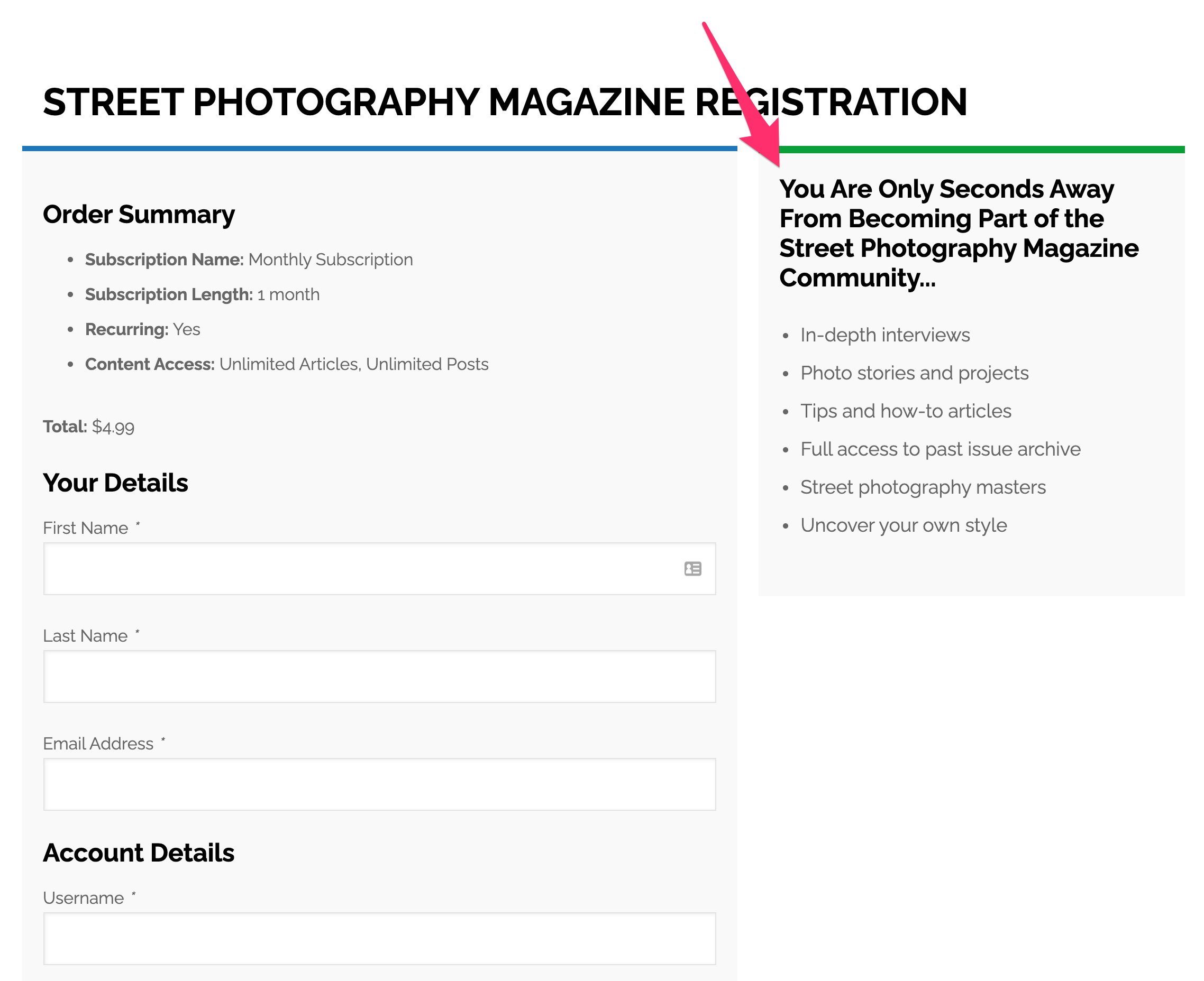
Fortunately, inspiration is all around us. Street Photography Magazine has found a picture-perfect way to optimize their registration page.
Cheer Them On
The registration page is the finish line of your sales funnel.
Your content draws them in, your paywall teases them along, your emails keep them moving forward, and your subscription options convince them to purchase.
By the time they reach the registration page, they’re committed. They know who you are, they’re ready to pay. Your last responsibility is to make the final steps as frictionless as possible.
So the page should be purely transactional. There’s no need to clutter it up with sales copy: they’re already sold. Present them with a clean form and a smooth path.
But that doesn’t mean your registration page can’t use a finish line cheerleader, to complete their experience.
Street Photography found a great way to do just that, without impeding the road forward. They made excellent use of the sidebar.

Make It Your Own
The sidebar on your registration page is a great space to add that final encouragement, like Street Photography has done.
But you could use that space for any number of final benefits: user testimonials, teasers for premium products, anything you want to highlight.
And since it’s off to the side, it doesn’t slow their momentum as they become a dedicated reader. Instead, they’re left feeling completely satisfied with their decision to join you.
