Case study: How to deliver custom content to your subscribers
A Tailored Experience
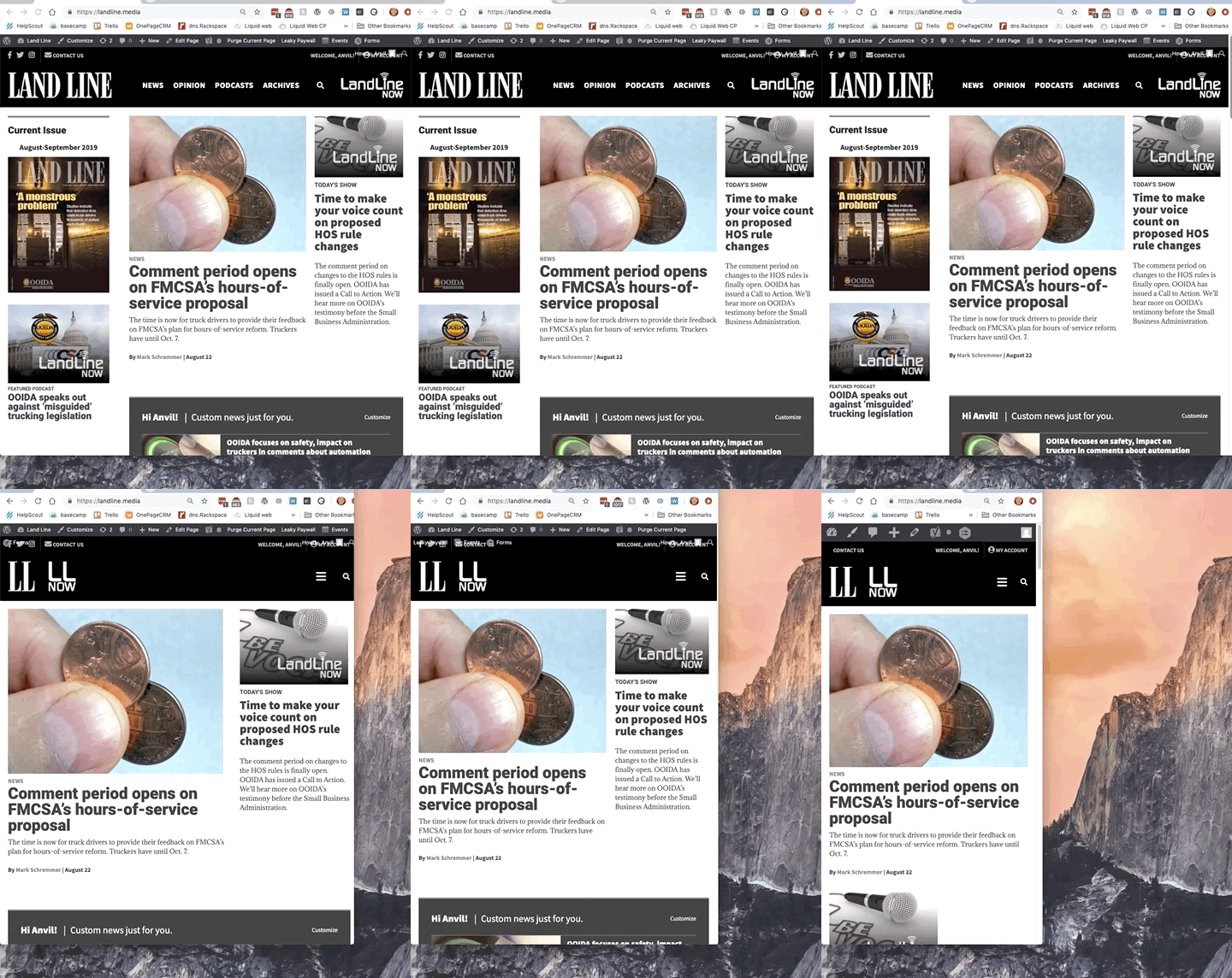
When Land Line Magazine relaunched its site, they placed a focus on making the content useful and accessible to its audience: truckers.

That meant making the content selectable by state (depending on where truckers were driving) and making it as mobile friendly as possible.
The result was a streamlined site that worked well on mobile and offered the subscriber the ability to check off the states they were interested in.
Articles were categorized in WordPress and tied to the subscriber’s selections. The overall outcome was a good one. Strong content and a format the readers could use…mostly.
A Small Problem
“When we first pitched the idea of a custom news feed, the developers at [ZEEN101] leaped all over it and delivered exactly what we asked for,” says Land Line’s Digital Content Editor Greg Grisolano. Logged-in readers could select the states that they were the most interested in. “But after some feedback from users, the vast majority of whom are mobile-only, we realized we needed to tweak the mobile stylings to deliver a cleaner user experience.”

The issue was the custom news feed. Even displaying only the top five relevant items, it took up too much space on a mobile screen.
So ZEEN101 went back to the drawing board, to deliver a richer customer experience.
An Improved Feature
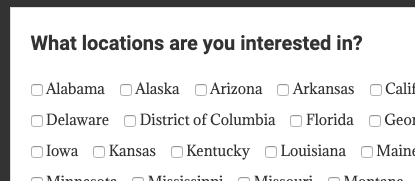
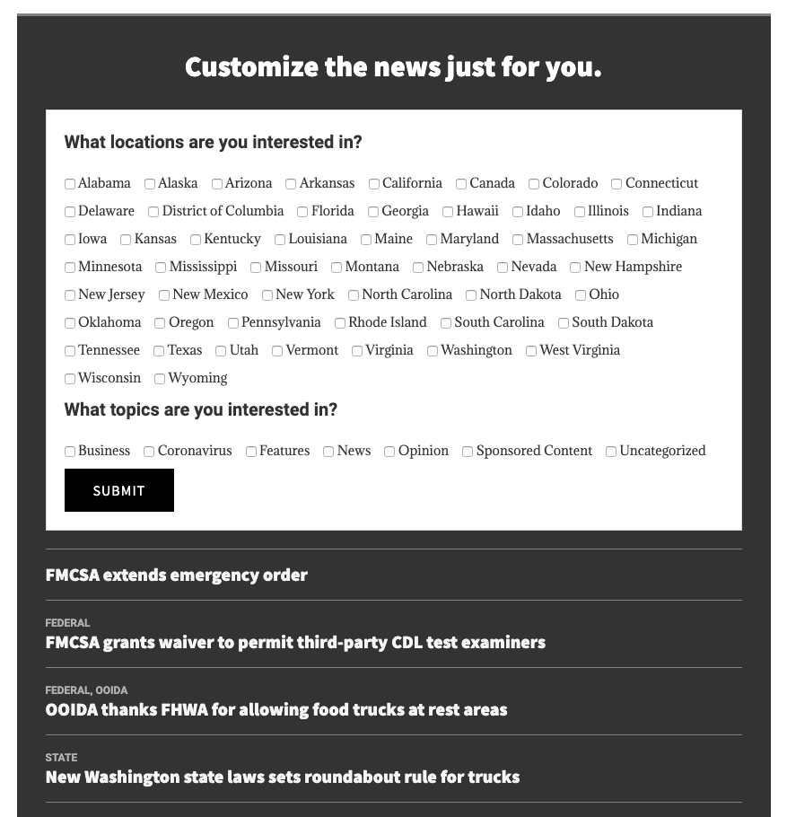
On their first logged-in visit, new subscribers are offered this selection box to customize their preferences:

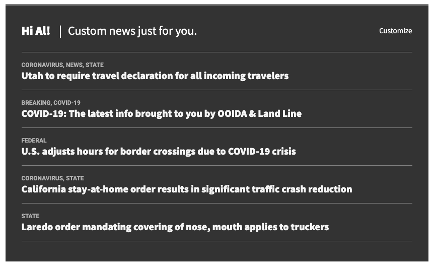
Once they’ve made their choices, members are treated to a much cleaner display of their custom content: just the headlines, no featured images, no article blurbs:

The new display takes up less space, leaving the custom content in balance with the general newsfeed that appears below.
Plus, the whole thing looks great on mobile.
Or as Grisolano says, “ Once again, [ZEEN101] answered the call and delivered what we asked for.”
Look out for our custom content add-on in 2021
