Custom subscription card and nag prompts to inspire conversions
An overlooked Weapon
You have subscription cards. It’s a necessary part of the process – bring them in with your awesome content and then you have a page that tells them how to get more and how much it costs.
But, used correctly, this simple necessity can actually become part of your sales pitch.
We’ve collected various different subscription prompt examples that each, in their own way, become part of the sales pitch, not just the process.
1. Dominion Post
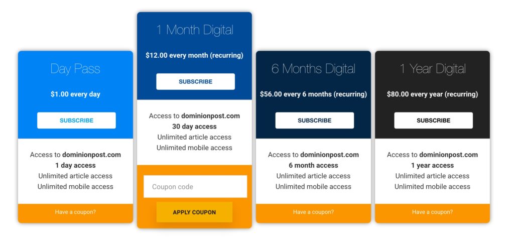
The Dominion Post is a local news source for Morgantown, West Virginia. The Dominion Post subscription cards are a great example of a fairly standard layout.
They show off four options – including one that’s a little out of the ordinary: month-by-month, biannual, annual, or a dollar-a-day pass. (You’ll notice they’ve also highlighted their most popular recommendation)
2. Digiday
Digiday publishes content geared toward digital marketing agencies and innovators. It has a solid, traditional subscription page that lays out the different plans and options. More interestingly, it also has a subscription card pop-up on members-only content.
After letting the guest read the first few lines of the restricted content, the rest is blurred out and overlaid by a simple card with an image that shows off all the content available to members and an invitation to subscribe, learn more, or log-in.

3. The Economist
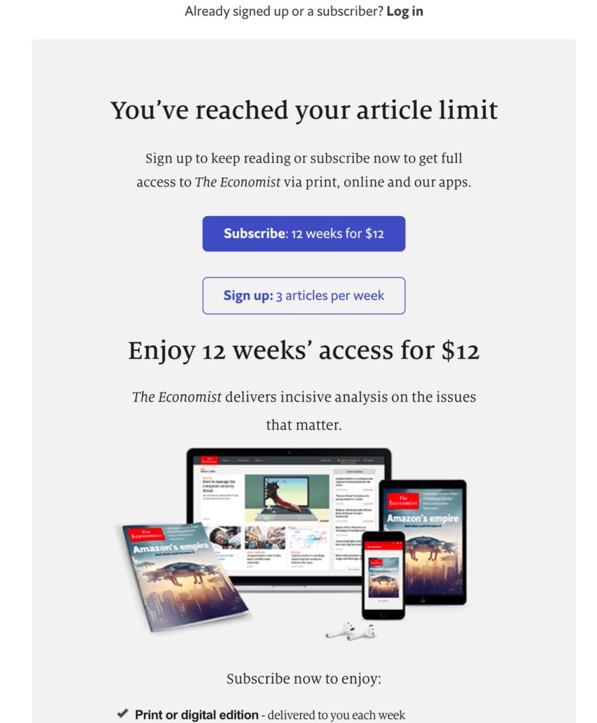
The Economist’s in-depth coverage of global news is legendary. They have a traditional subscription page but also a clever pop-up subscription card. Rather than overwhelming the reader with the full glut of the weekly magazine, they offer smaller digital packages to the reader once the free articles have run out.

4. Relevant Magazine
Offering Gift subscriptions.

5. Top Draw
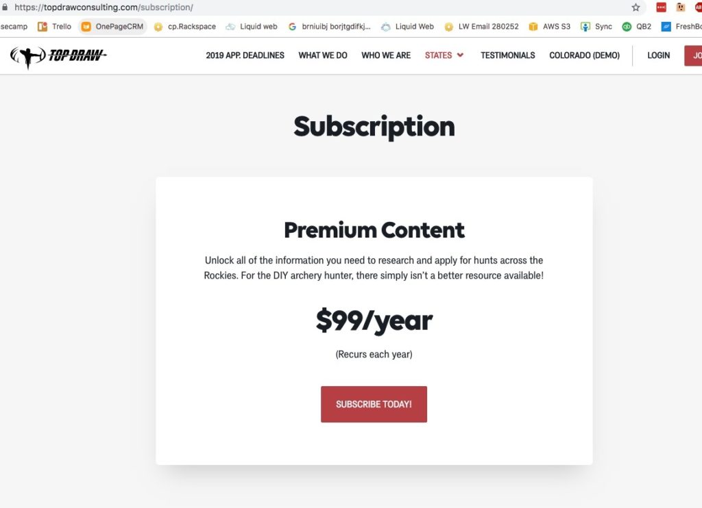
By contrast, the Top Draw subscription card is entirely minimal, a simple explanation of what members will get. Top Draw publishes information on planning bow-hunting expeditions in the Rockies. Like Mark Manson’s, the Top Draw subscription card reflects the audience it is intended to reach.

6. Registration page (use our registration shortcode to output the form):


7. In content promo using Ad Dropper:

8. Simple choices. You can build your own cards:

9. Subscription nag:

10. Clean nag:

11. Simple nag:

12. Elegant promo to subscribe using Ad Dropper (hide from paid subs):

13. Content nag:
14. Simple design nag:

15: Simple nag with the critical button (yes always use a button):

16. Subscription page with sales copy:

17. Subscribe messaging:
18. Subscription page with donate and gift subscriptions:

19. Subscribe page with donations and newsletter optin :

20. Subscribe page with group subscriptions:

21. Incentives for subscribing

22. Adding Cloudflare Turnstile to prevent bot sign ups

23. Using discount Coupons and creating urgency to subscribe with limited offer.


